

Choosing case colors for the Burgundy iPhone 18 Pro and Pro Max has presented an interesting challenge for WawCase. Shades that complement Black or Silver phones don’t always work with Burgundy, especially when the original finish remains visible around the large camera plateau.
Burgundy offers the closest color match, while Taupe provides a softer contrast and Black creates a darker two-tone appearance. Olive Green is a distinctive alternative, with Navy Blue and Dusty Pink offering different ways to pair with the phone’s wine-red finish.
Best Case Colors for the Burgundy iPhone 18 Pro and Pro Max
1. Burgundy: The Closest Color Match
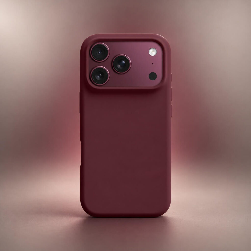
A Burgundy case creates a coordinated appearance by bringing the phone and its cover into the same color family. It’s the most natural choice for anyone who wants the original wine-red finish to remain the dominant color.
The challenge is finding the right shade. Apple’s Burgundy Silicone and TechWoven cases have different surface textures, which affect how their colors appear beside the phone. A case that leans toward brown or purple can create a visible difference even when both products are labeled Burgundy.
Mulberry is another shade worth distinguishing from Burgundy. Apple’s Mulberry TechWoven has a lighter, more purple-leaning appearance, making it a tonal alternative rather than an exact match.
2. Taupe and Beige: Warm Neutrals That Lighten Burgundy
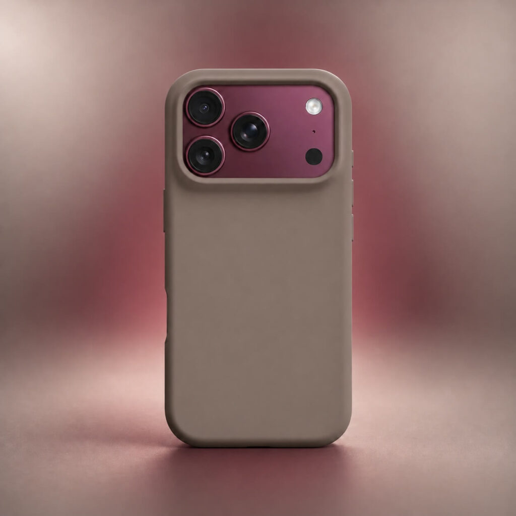
Taupe combines muted brown and gray tones, creating a gentle contrast with Burgundy’s deeper red finish without introducing a competing vivid color.
Beige and cream offer brighter alternatives. Beige has a warmer, sand-colored character, while cream produces a more noticeable contrast against the Burgundy camera plateau.
Taupe has received positive feedback from Burgundy iPhone owners on Reddit. In discussions comparing actual case combinations, some owners specifically praised the contrast between Taupe TechWoven and the Burgundy phone, making it a particularly strong option for buyers who want a lighter case.
3. Black: A Defined Dark Contrast
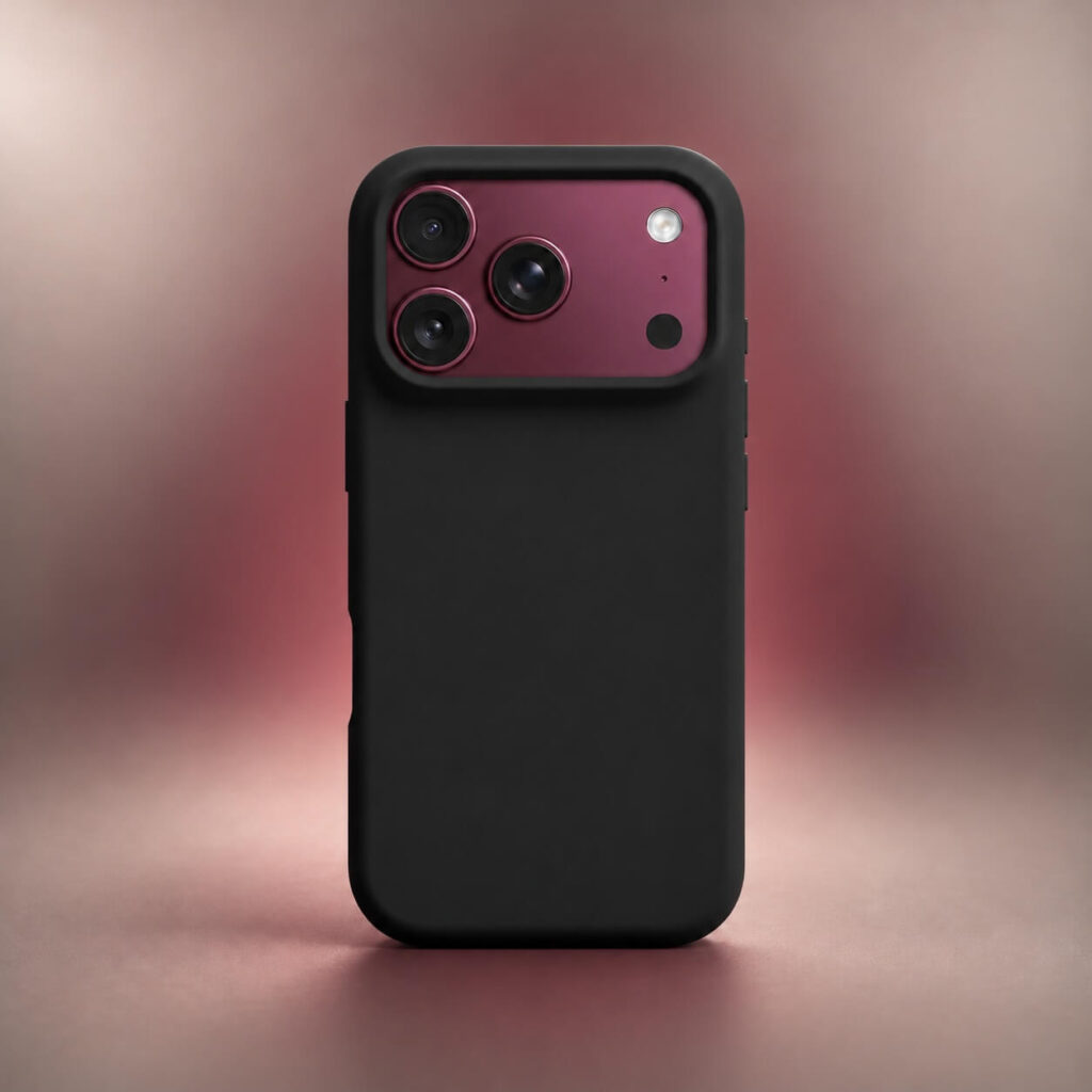
Black creates a clear boundary against Burgundy without introducing another hue. On a solid black case, the exposed wine-red camera area becomes a distinct color accent, giving the phone a bold two-tone appearance.
Unlike an attempted Burgundy match, Black doesn’t need to reproduce the phone’s red or purple undertones, and it works across a wide range of simple and decorative case designs.
A matte black finish emphasizes the color separation, while woven or textured black introduces additional surface detail.
4. Olive Green: An Earthy Color Contrast
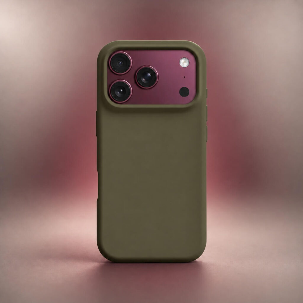
Olive green combines muted green with brown or gray undertones, creating an earthy contrast against Burgundy’s rich red finish. The relationship between the two colors is more distinctive than a neutral pairing, but less intense than combining Burgundy with bright green.
The precise shade matters. Dark olive with stronger brown undertones creates a warmer combination, while a greener olive produces a more obvious contrast. Apple’s Olive TechWoven case is a relevant example, with its woven surface giving the color a textured appearance.
Owner reactions to Olive and Burgundy are mixed. In another Reddit discussion showing the combination, several owners praised the pairing while acknowledging that others dislike it. It’s worth considering if you want a recognizable second color and find conventional matching combinations too restrained.
5. Navy Blue: A Dark Alternative to Black
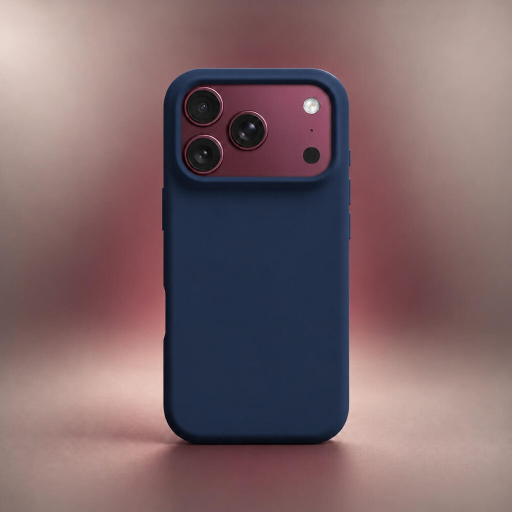
Navy blue pairs Burgundy with another deep color instead of a neutral. The cooler blue contrasts with the warmer red-purple finish, creating a combination in which both colors are recognizable without requiring a bright case.
Unlike Black, Navy introduces a distinct hue that becomes more noticeable in brighter lighting. It also differs from lighter blues such as Chambray Blue, one of Apple’s TechWoven colors, which creates a greater difference in brightness.
6. Dusty Pink: A Softer Tonal Alternative
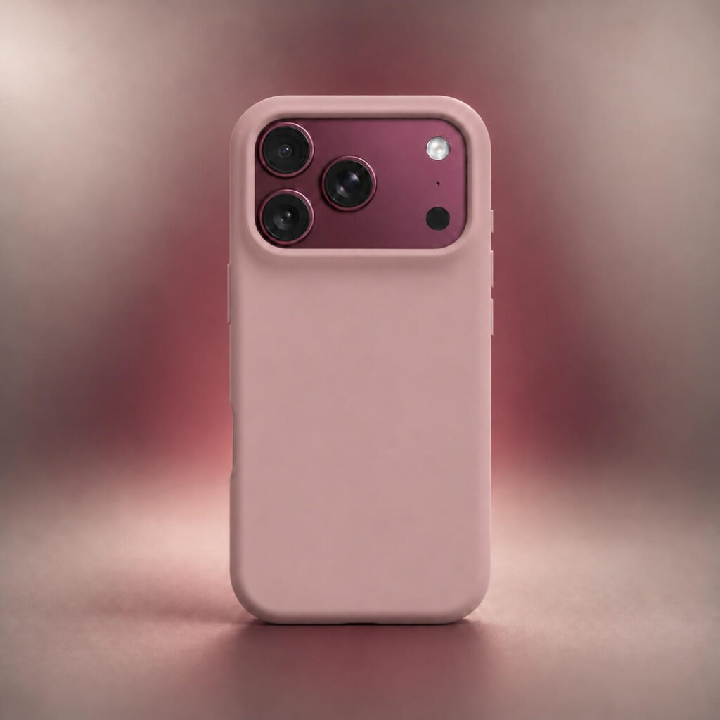
Dusty pink creates a lighter tonal contrast with Burgundy, pairing a pale, muted pink with the phone’s deep wine-red finish.
A dusty rose shade with gray or brown undertones creates a gentler combination than bright bubblegum pink or magenta. The latter shades produce a more prominent, colorful contrast, which can overpower the muted character of Burgundy.
This pairing is particularly interesting for cases with floral patterns, small motifs, or restrained pink backgrounds. The darker Burgundy phone color can become part of the overall design rather than something the case needs to conceal.
How Different Case Designs Change the Burgundy Look
The case’s construction determines how much of the original phone remains visible, so the same color can produce different results across case styles.
Clear and Frosted Cases
A fully clear case reveals the Burgundy finish across most of the back, making it an alternative for buyers who would rather display the phone’s original color than replace it with another shade.
Magnetic rings can change that appearance. Some transparent cases have prominent white rings, while others incorporate colored rings or less visible magnetic components. A matching Burgundy ring can blend more naturally with the phone, whereas a contrasting one becomes part of the design.
Frosted cases behave differently. Their translucent surfaces diffuse the underlying finish, reducing its visual clarity. Depending on the tint, Burgundy can appear darker or more muted than it does through a fully transparent back.
Bumper and Frameless Cases
A bumper case typically surrounds the phone’s perimeter while leaving much of the back uncovered. Its color appears mainly as an outline, so even a contrasting bumper doesn’t occupy as much visible space as a solid case.
Frameless designs vary in construction. Some expose large portions of the Burgundy frame, while others retain small sections around the corners, camera, or back.
Coverage is the important tradeoff. Minimalist cases don’t necessarily protect the same areas as conventional full-wrap designs, so check the actual edge and corner construction before choosing one.
Two-Tone and Opaque Cases
Two-tone cases combine different colors across the back, frame, or camera surround. A beige back with a Burgundy frame, for example, can connect the case to the phone’s original finish while retaining the lighter appearance of a neutral back.
With opaque cases, a large rectangular camera cutout exposes more of the Burgundy plateau. A design that covers the plateau with individual openings for the lenses, flash, and sensors can conceal nearly all of the original color. This gives you much more freedom to choose any case color without worrying about matching Burgundy.
Wallet and Folio Cases
A folio case covers the phone’s front when closed, while its outer back conceals most of the original Burgundy finish. Black, dark brown, and Burgundy leather or leather-style covers offer different color options for this design.
Magnetic card wallets introduce a smaller accent on the back of a compatible case. A contrasting wallet can add a second shade to an otherwise matching case, while a coordinated wallet creates a more uniform appearance. Its size and placement determine how prominently that additional color features in the overall design.
What to Check Before Buying a Case for Your Burgundy iPhone
Start by looking for photographs showing the case installed on a Burgundy iPhone. Product images featuring Silver, Black, or another phone finish won’t accurately demonstrate the color pairing. Real customer photographs can also reveal differences between advertised shades and their appearance under ordinary lighting.
Check that the selected case version is specifically compatible with your iPhone 18 Pro or iPhone 18 Pro Max. The two models require different case sizes, even when the color and design are identical.
If an exact color match is your priority, compare the case directly with the visible phone finish instead of relying on matching color names. For patterned or multicolored designs, examine the dominant background color as well as smaller accents to judge the complete combination.
Finally, check that the product listing shows the actual variation you’re ordering. A seller offering several colors or case constructions may use different photographs for each option, and the details that make one combination attractive may not carry over to another.